← WorkSukiyaki

Brand and menu system for a Japanese restaurant

Role
Brand and product design
Period
2024
Owned
Self-directed — research, identity, art direction, interface, motion
Outcome
One system, holding from a menu row to a billboard.

I first designed this as a concept when I was starting out. Came back to it in 2024 and treated it more like a product. Sukiyaki is a communal dish, a pot everyone cooks from at once. The identity is built on that: the meal as something shared, not something ordered.
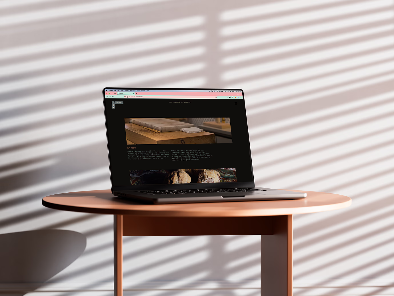
The Sukiyaki site open on a laptop, showing the story section between two photographs
Photography carries the warmth. The type stays out of its way.

The research went into Edo-period printing and traditional palettes. What kept coming back was discipline over decoration: balance, negative space, restraint. Most hospitality sites reach for ornament and end up looking like each other. I wanted to see what happened without it.
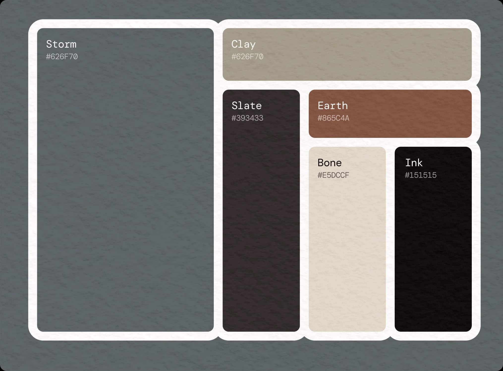
The six-colour palette, each swatch named and given a hex value
Six named colours. The constraint keeps thirty screens feeling like one system.
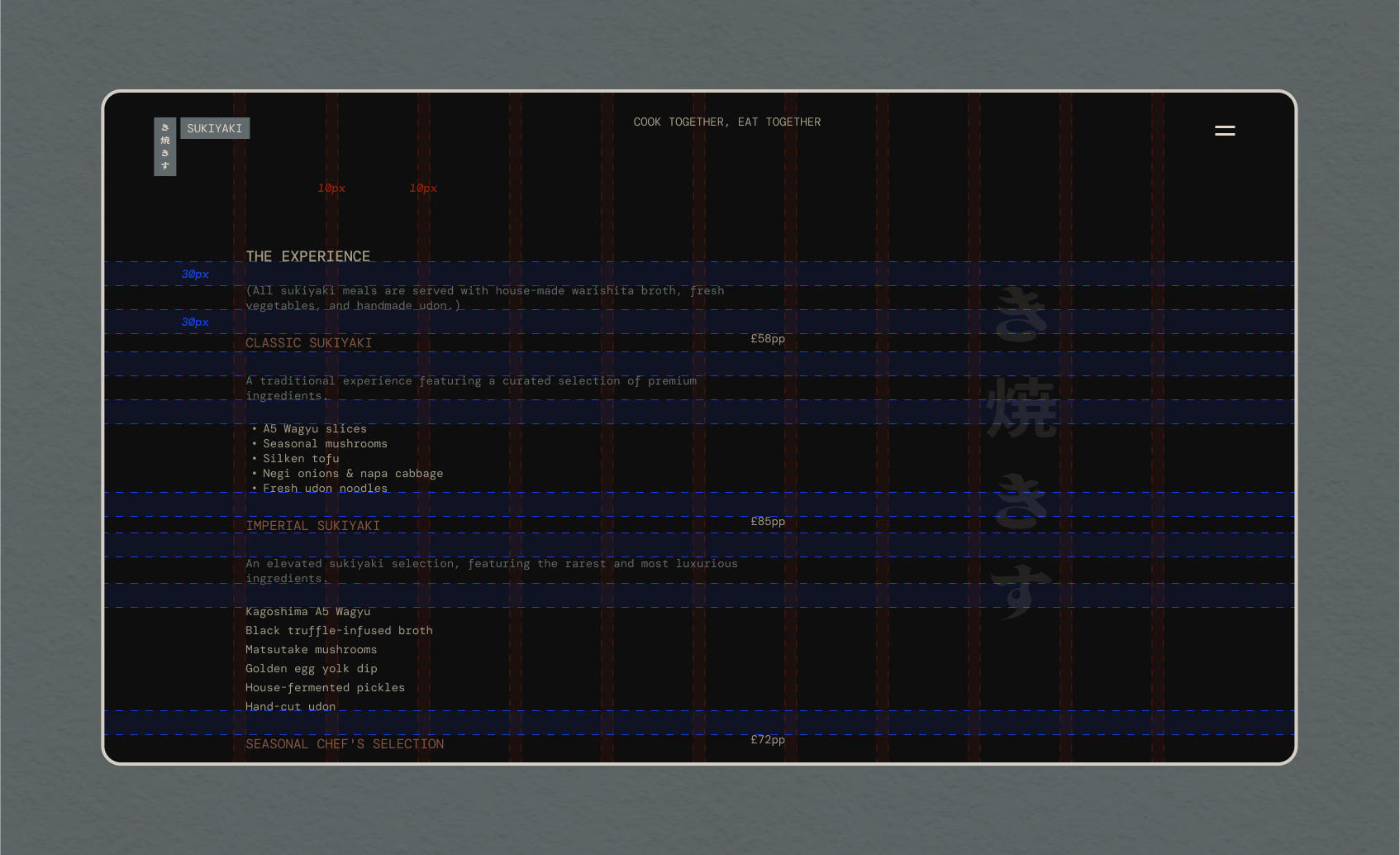
The menu page with its layout grid and spacing annotations overlaid
Thirty items, three tiers and a column of prices, all from one baseline grid.
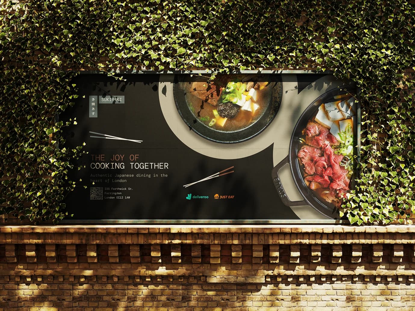
A Sukiyaki billboard on an ivy-covered wall, showing two pots photographed from above
Same type, same palette, same restraint, outdoors at scale.