Two products, and traders wanted both
Moonit traded Solana meme coins — an asset class where a position can double or evaporate inside a minute, and where the people trading are doing it all day, at speed, with their own money. Everything interesting about the product is a consequence of that clock.
The market had settled into two shapes and neither was right. One was the power tool: deep functionality, extended trading controls, a heavy layout that assumed you knew what you were doing. The other was the social one — lighter, funnier, built around memes and community, with a fraction of the tooling. Traders used both, for different things, and the assessment I opened with said so plainly.
So the brief contradicted itself on purpose: a powerful trading tool with deep functionality, and at the same time fewer tools, more fun, more replies than stats. MoonPay had just acquired Helio, and with it the credibility of a regulated payments company — which made the opening narrow and specific. Build the fast, social thing as infrastructure rather than as a casino.
I made time-to-trade the design KPI. Not satisfaction, not task success — the number of seconds between a trader seeing something and being in a position. It was the only metric that described the actual job, and it turned every layout argument into an arithmetic one.
The first designs were too childish
That is close to a direct quote from the feedback, and it was right. The early work leaned so far into the social read that it stopped signalling a powerful tool — and for a product asking people to move real money at speed, looking playful is not a neutral cost. The same round asked for the three-column view serious traders already worked in, and for the original brand colour back.
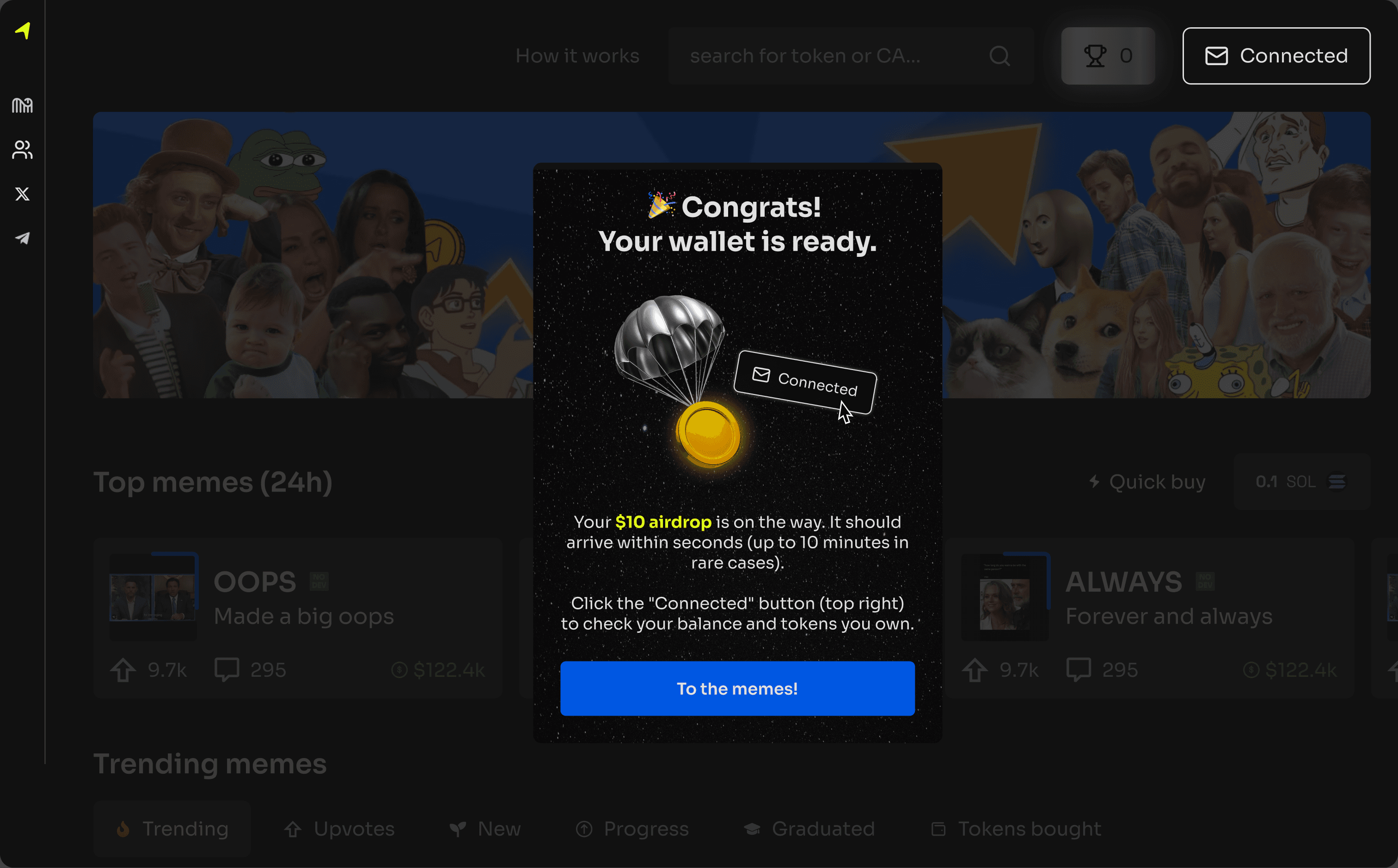
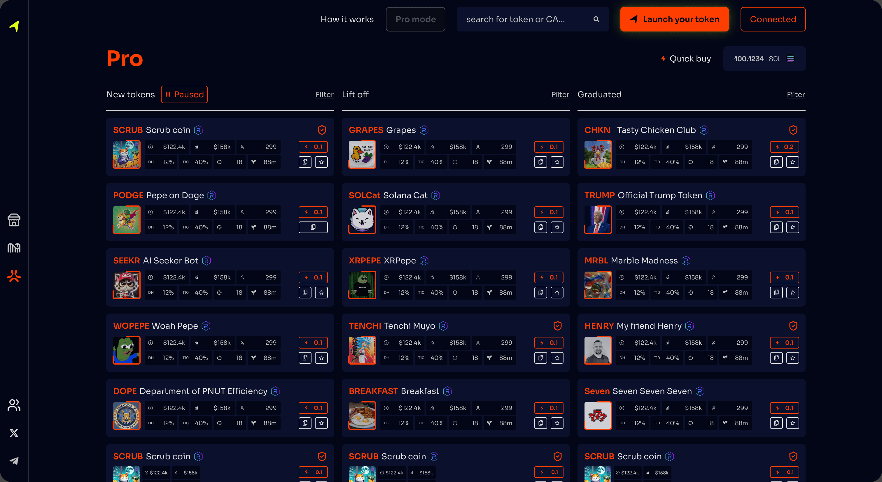
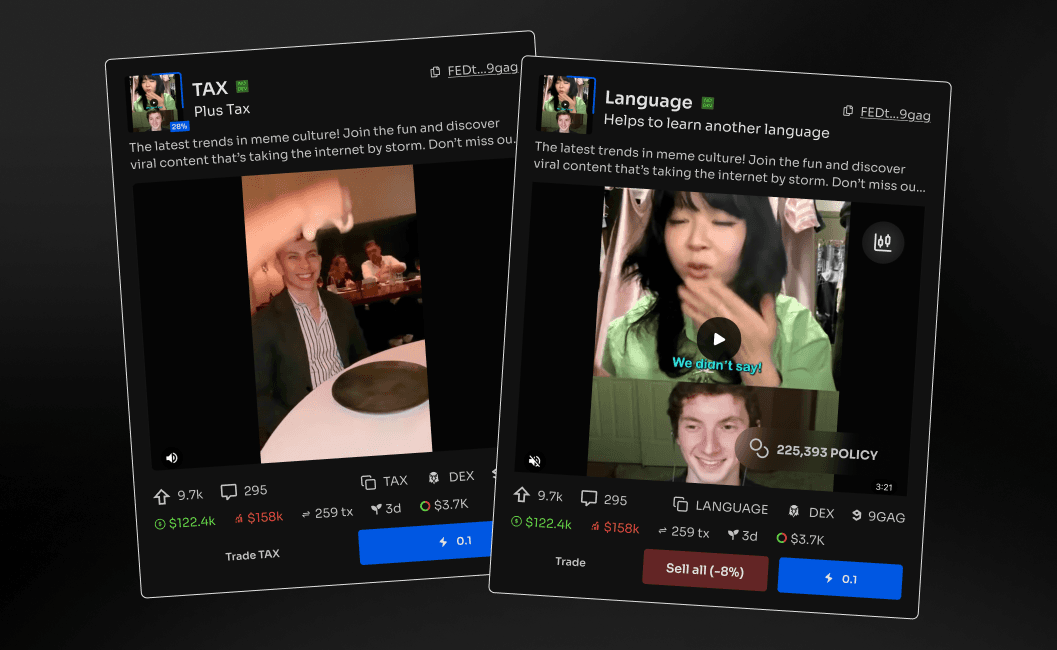
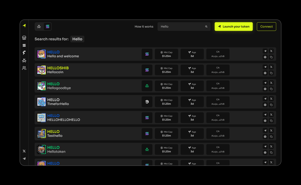
The obvious response is to split the difference and land somewhere bland. Instead the interface got two modes. Fun is the screen above: condensed navigation, imagery given room, and the trade controls still on every card. Pro is three columns pinned to the three moments a token passes through — new, lifting off, graduated — each with its own filters, so a trader can watch all three entry points at once instead of switching between them.
What makes that affordable rather than two products is that the token card is the same component in all of it: fun, pro, desktop, mobile. One thing to build, one thing to change, and the layout around it carries the difference in tone. It also means a trader moving between modes never has to relearn the row they actually make decisions from.
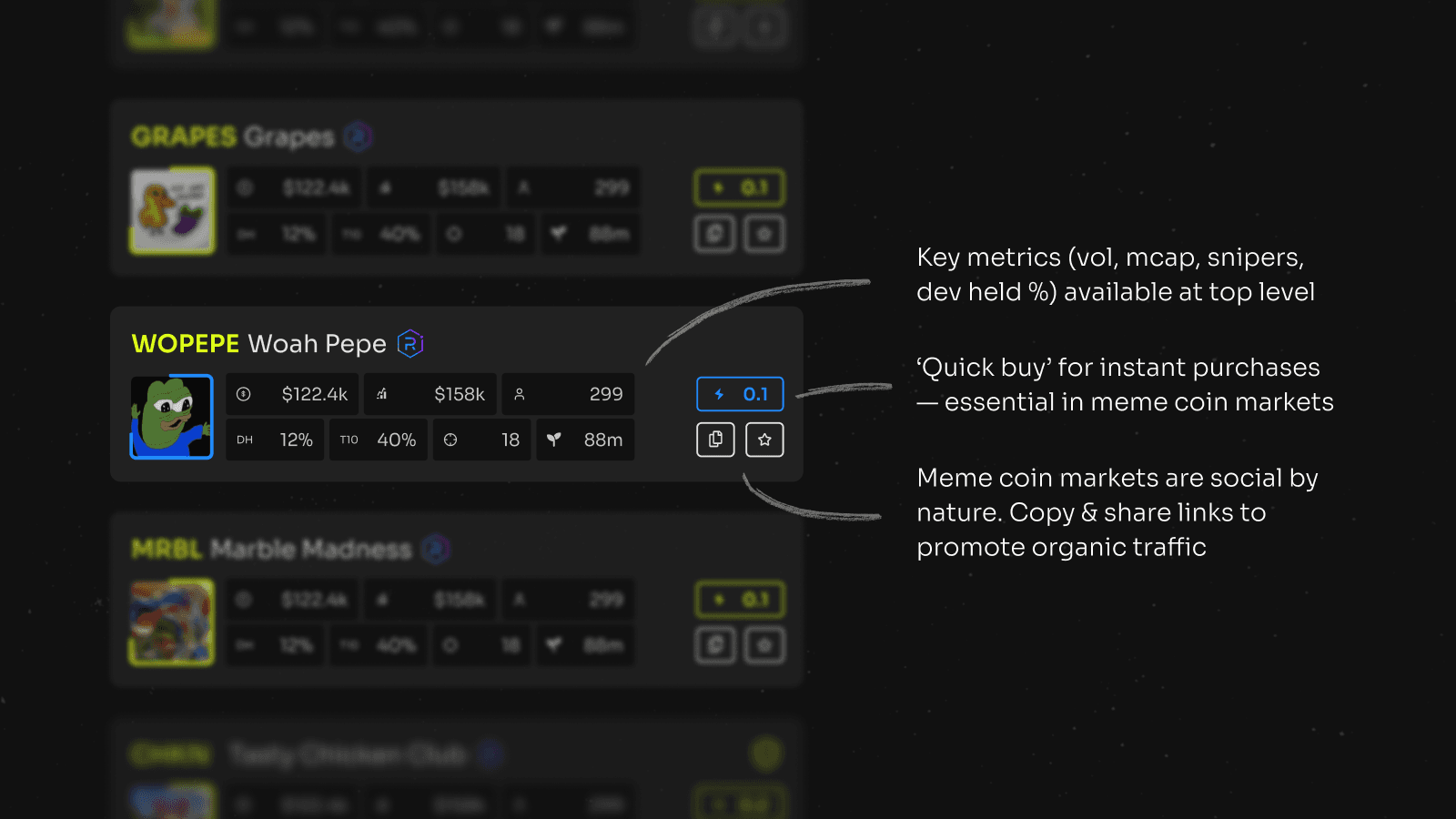
Measured against time-to-trade, the conventional pattern was indefensible. Browse, click, load a detail page, buy: four interactions, one of them a page load, at exactly the moment a price is moving. So the trade went onto the card — every row carries its own amount input and execute control, and quick buy bypasses the token page entirely and goes straight to the transaction.
The cost of putting more on a card is that it stops being scannable, so the secondary controls — watchlist, quick buy — only appear on hover. Hover does not exist on touch, where the same controls come in on a swipe. That is more work than one layout for both, and it is the difference between a card that works on a phone and a card that was designed on a desktop.
- From seeing a token to holding it
- Under 2sFrom seeing a token to holding it
- Interactions to take a position
- 4 → 1Interactions to take a position
Volatile asset, solid instrument
The hardest problem was not speed, it was tone. Traders had to believe the platform was quick enough to be worth using and stable enough to hold their money — and the visual language that signals the first usually undermines the second.
So I built it as an instrument. A dark surface where colour only ever means something — direction and state, never decoration — and a grid that holds its alignment as figures change width, so a moving number never moves anything around it. The reference point was a trading desk rather than a consumer app, because the promise it makes is the right one. An instrument does not ask you to trust it. It shows you it is measuring correctly and lets you conclude that yourself.
The chart is where that got negotiated. Left alone I would have drawn something more minimal than the category expects; traders expect TradingView and read anything else as a toy. What shipped is a lighter build of the thing they know — familiar enough to be trusted at a glance, quiet enough not to dominate a screen whose real job is the token list.
Error states carried more of this than anything else. On a product where a mistake is unrecoverable, the failures are the credibility: every rejection says what happened, whether the position was taken, and what to do next. Vague failure is the fastest way to make a fast product feel dangerous.
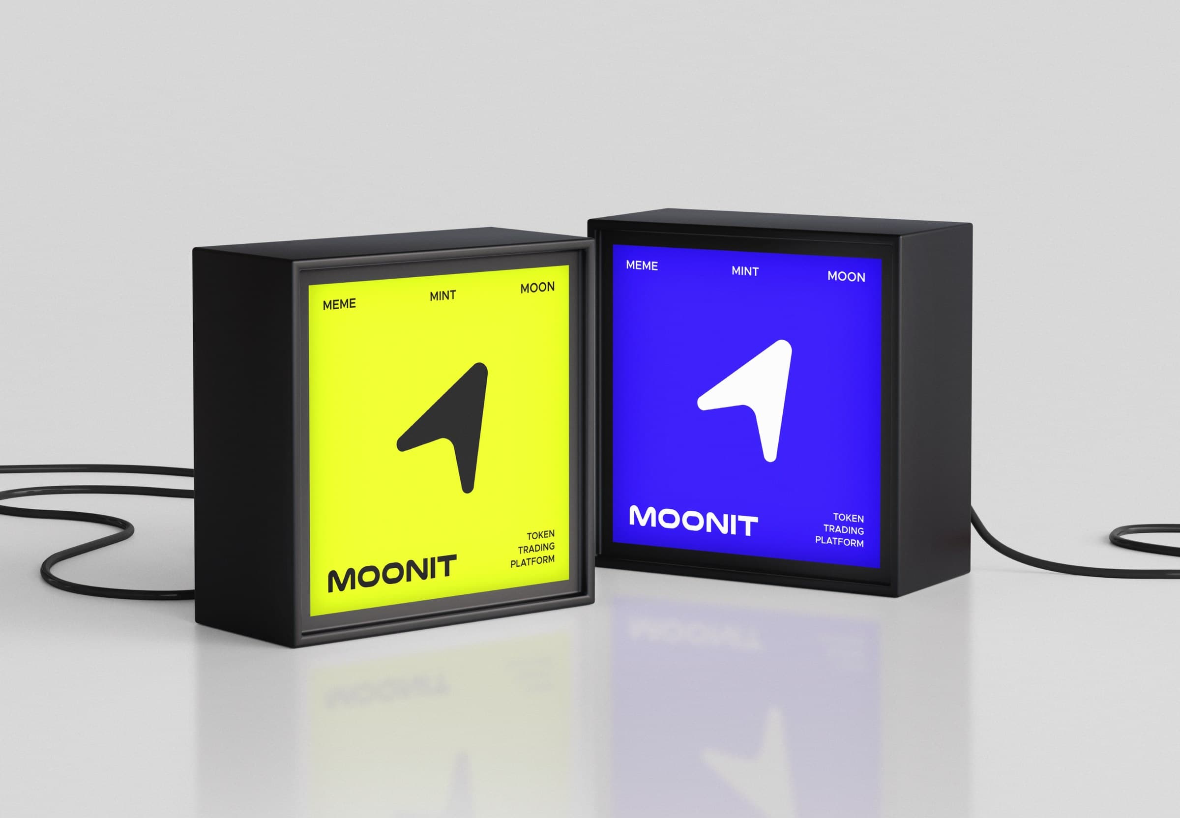
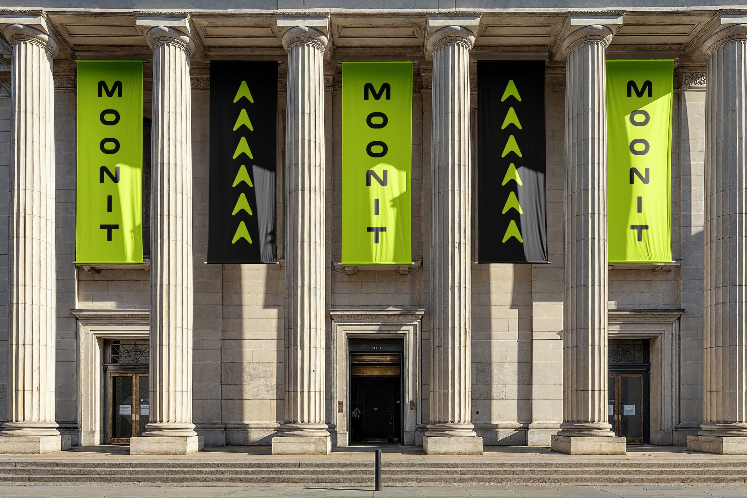
The identity ran the same problem in miniature. Three directions went up: a rocket, which was the most distinctive shape but would have dragged the whole brand into space imagery; a cursor, which was flexible and generic; and one that resolves as all three at once — cursor, rocket, and an M. The third won because it was the only one that could carry the tone without committing the marketing to a theme.
I was the only designer on it — strategy, brand, interface, motion and the launch assets — so the constraint was never craft, it was triage. Most of the value I added was in the argument about what did not get made rather than in the artefacts.
The decision I would take furthest is the two modes. They were scoped as a way to settle an argument about tone and turned out to be the product’s actual structure — but they shipped as two layouts rather than as a system that knows which one a given trader wants. The thing I would do differently is the cut list: a single metric applies pressure evenly to everything, including the moments where a trader ought to slow down — a first trade, an unusually large one — and those deserved friction I did not design, because the metric I had chosen counted friction as failure everywhere.