
Diversification you had to do by hand
In 2021 this market was the wild west. Index investing did not exist. If you wanted a diversified position you held it piece by piece: ten or more assets, a separate contract approval for each, rebalancing by hand every time the weights drifted.
The product collapsed all of that into a single position. One purchase, automatic rebalancing. The design problem was how far I could simplify without losing what made it useful.

One switch
Underneath, buying one unit fired a basket of swaps and contract interactions. I showed none of it. One product, one action.
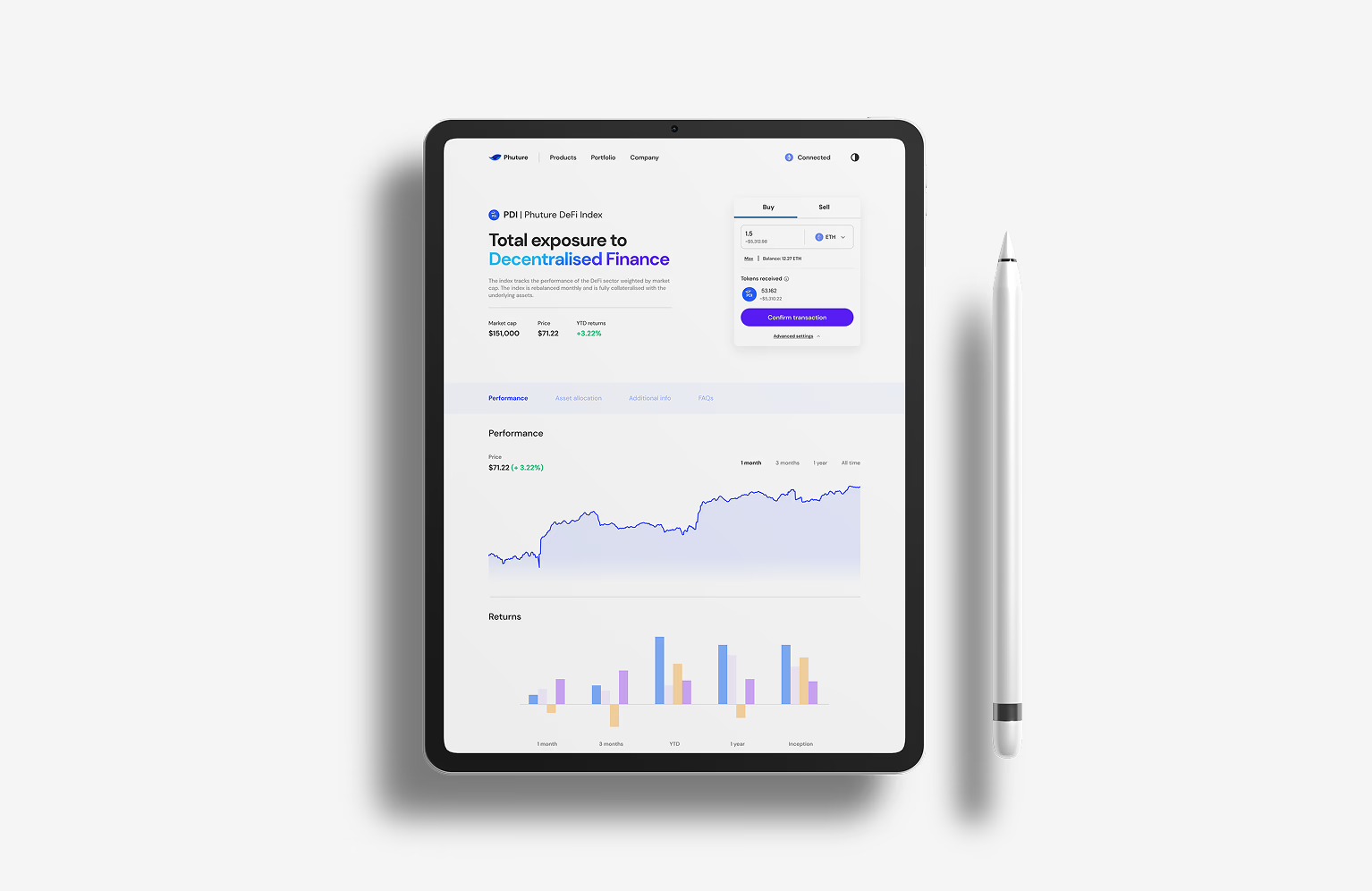
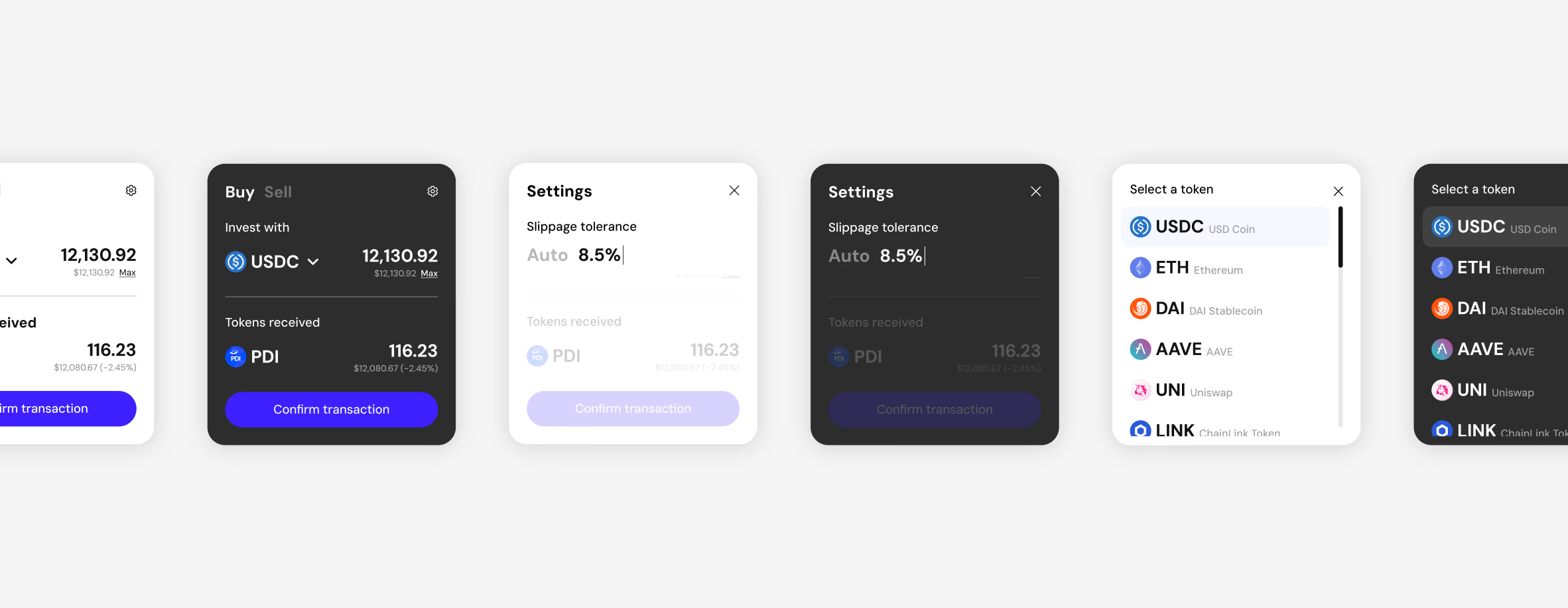
We refined the widget over months, stripping it back. Slippage tolerance, the funding asset, fee breakdowns went behind a settings cog. The controls stayed one layer down, designed properly, because a product you can't see into asks for trust this audience was not handing out.
- Held on the platform, post-launch, in a bear market
- $8M+Held on the platform, post-launch, in a bear market
- Approvals to hold a diversified position
- 10+ → 1Approvals to hold a diversified position
Hide the mechanism, expose the data
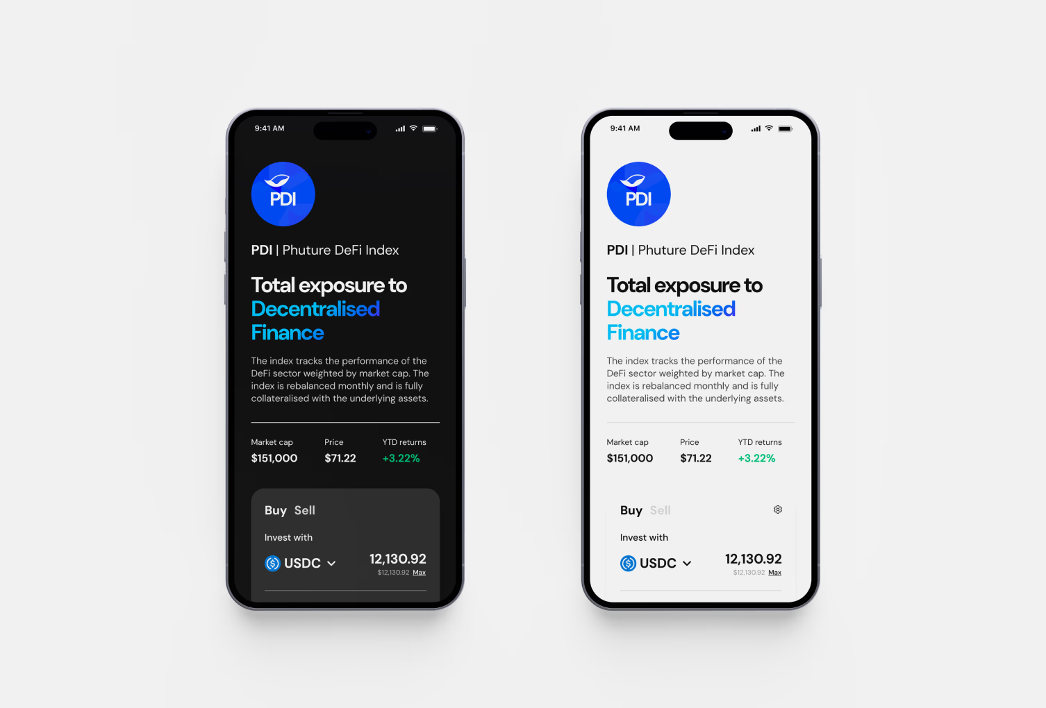
Hiding the plumbing creates a risk: if users can't see in, they have to take it on faith, and this audience had been burned by exactly that. The rule was simple. Hide the mechanics, show the data. Composition, weights and fees sat on the surface, not behind a link to a document.
The website was minimal and professional: Space Grotesk, whites and blues. It read closer to a bank than a game, and that distance from the gamified set did the positioning before anyone read a word.
I designed the analytics to show long-term movement, not micro-volatility. Candlesticks make a five-minute move look like an event, and people act on events. Smoothing the chart was the single biggest factor in the retention number, because the behaviour it suppressed was panic selling.
- Average retention, well above the category
- 211 daysAverage retention, well above the category